UX, UI, User testing · John Lewis · 2016

Whilst at John Lewis, I primarily worked on the checkout part of the website for smaller screen devices. At that time, the checkout was partially responsive, meaning it was optimised for desktop screens and would scale down to tablet devices. For smaller screen devices, users would get a separate mobile site which was slow and dated.
The new initiative was to make the checkout fully responsive down to mobile and then eventually lose the mobile site completely. Some components of the site scaled down quite easily without needing much work, however other areas required a complete redesign to ensure optimum usability on smaller devices.
One of these complex areas were the delivery options when placing an order. This article documents how I led the process of redesigning this component for mobile.
Taking the look and feel from the responsive desktop site, the previous design looked like this...
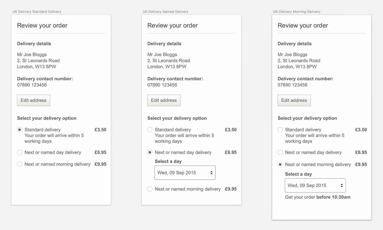
There were three clear options: 'Standard delivery', 'Next or named day delivery' and 'Next or named morning delivery'. These were presented as radio buttons with the available dates presented via a dropdown menu.
Although this design did the job, there were also areas of concern highlighted by customer feedback. This included the following:
The team and I acknowledged these comments and agreed there was plenty of room for improvement. The first thing we needed to do was outline what we wanted to accomplish.
Taking into account the customer feedback as well as business goals, we put together a list of objectives to aim for:
The next steps involved gathering insights which would steer the design. This involved speaking to the business and the appropriate internal teams, carrying out competitor analysis, and discussing constraints with the technical team. This research gave me enough to go on to start sketching and producing wireframes.

After wireframing, two clear patterns started to emerge for the named day delivery option. I decided to jump into Sketch (the app) and mock up something more high fidelity.

This design featured a row of horizontal dates with additional dates hidden off-screen. The far right date had half of the date hidden, indicating that there were more dates off-screen, encouraging the user to swipe across.
As this was a fairly new pattern and not exactly conventional, I also added a 'More' link directly above the dates which acted as an additional affordance. Clicking this link would return the same behaviour as if swiped (i.e. the dates would swipe across), informing the user that the dates can be swiped.

This concept squeezed more dates onto the screen and provided a two-week overview. Insights showed that most customers tended to order within 7 days, so by providing up to 14 days, the user should be able to select their date in one click/tap. Similar to concept 1, there was also a link for 'More Dates' if the user wished to select a date further into the future.
Now that we had two strong concepts, the next step was to test these designs with real users. These were 5-10 participants chosen from John Lewis' marketing shopper segmentation to allow for a mixed sample.
To ensure we were on the right track, we also tested the original dropdown concept. This was mainly to validate the new concepts and see if the participants agreed that these were an improvement.


Once the testing was complete, we found there were several key themes which were highlighted with the concepts. These were:
A few participants had difficulties understanding whether a state was active or inactive. This resulted in them attempting to select unavailable dates.
All participants found and understood how to change from 'Standard delivery' to 'Named day' or 'Named morning' with no issues.
A few users failed to understand whether the default day selected was today or if it was the first available date for delivery. The majority expected the default option to be the latter.
All participants were able to move to the next week without any issues. This was consistent across all the concepts. There were a couple who failed to understand the swipe interaction on the one week view, however, they were able to click on the 'more' link to reveal more dates.
A few participants struggled when selecting dates via the native dropdowns. One mentioned that they expected to see a calendar.
At the end of the user sessions, the majority of participants stated they were not keen on the dropdown and preferred the newer concepts, which was in line with the customer feedback we'd received.
Although there were no major usability issues which differentiated the one-week concept over the two-week concept, the majority of participants felt that the two-week concept was more intuitive and had less room for error. The testing confirmed this as the participants managed to get through the two-week view quicker than the one-week view. All participants clearly understood the calendar structure. They liked having an instant overview of the two weeks as this gave them a better context of where they are in the week. This was in contrast to the one-week view, which only showed the next few days as all future dates were obscured off-screen.
Although the two-week view was the favourite, a few members of the team did express a concern for the size of the hit area of the selectable dates. They felt on smaller devices such as the iPhone 5 (320px width), users may struggle to select the correct date. However, all testing was done using an iPhone 5 and there didn't appear to be any issues at all. Either way, it was something I took into consideration.
So armed with this feedback, it was enough for me to go ahead and create the final design.

Throughout this process, it's clear to see how much the design had evolved. While the format is largely the same, the design is more on-brand and the interaction is far richer.
Something else you may have noticed is the height of the page had increased, especially when the second delivery option is selected (as seen in the image below). Increasing the length of the page is always a hot topic and can be controversial at times, however, I would argue that it depends on the value you are giving in exchange for that space. To scroll down a page takes minimal effort yet interacting with a subpar element can lead to frustration. In this instance, my implementation of the two-week view reduces clicks/taps and gives a clearer context of the week ahead. I feel this justifies compromising screen space.


Now that I have come to the end of the project, I will take a look at the initial brief and identify how my design provided solutions to the issues identified.
I have visually strengthened the grouping of the three delivery options by boxing in this entire component, adding clarity to their association. Another improvement is by adding captions under each delivery type, I have given these additional options more weight and in turn, offer a bit more context at first glance.
The new visual grouping makes the information easier to process and is also aided by bringing in the brand colour to highlight the selected delivery option.
This is solved by replacing the dropdown menu with the new two-week view.
This was a problem highlighted in user testing. Although the unavailable dates were greyed out (available states had a white background), for some user participants this was not obvious as the contrast was not strong enough. I have increased the contrast for unavailable dates and also added a diagonal line for further clarity.
Due to what the majority of users expected, I made sure the first available delivery date is the first selectable date in the calendar.
As I mentioned previously, this was more of an internal concern as the user testing proved this was not an issue. However, I took this into account and increased the vertical spacing of the dates, so even on the smallest devices, the hit area was more than adequate.
I have thoroughly enjoyed being a part of this project and working closely with the UX team has been eye-opening. To think in terms of the user is often easier said than done, which is why I find testing my work with real users hugely rewarding and educational.
This experience has given me more practice not only with critical thinking and design but also with sharing my work early on in the project to other members of the team. This allowed me to receive valuable feedback which in turn generated stronger designs. This is something I will take with me to future projects.
Thanks for reading and be sure to check out my other work.