UX, UI, Prototyping · John Lewis · 2015-2019
The evolution of the gift voucher iterations over 4 years.
During my time at John Lewis, there were several iterations of the gift card and voucher interface to provide the best user experience for the customer.
The original design was desktop-only so my first iteration was making this fully responsive, catering for all devices.
Each iteration was backed by UX research, customer feedback and holding regular UX workshops which helped inform design decisions going forward. These designs were then validated via user testing sessions with real customers before going live to the public. This was done by creating interactive prototypes before going to development.
This is a brief overview of the journey from one iteration to another.
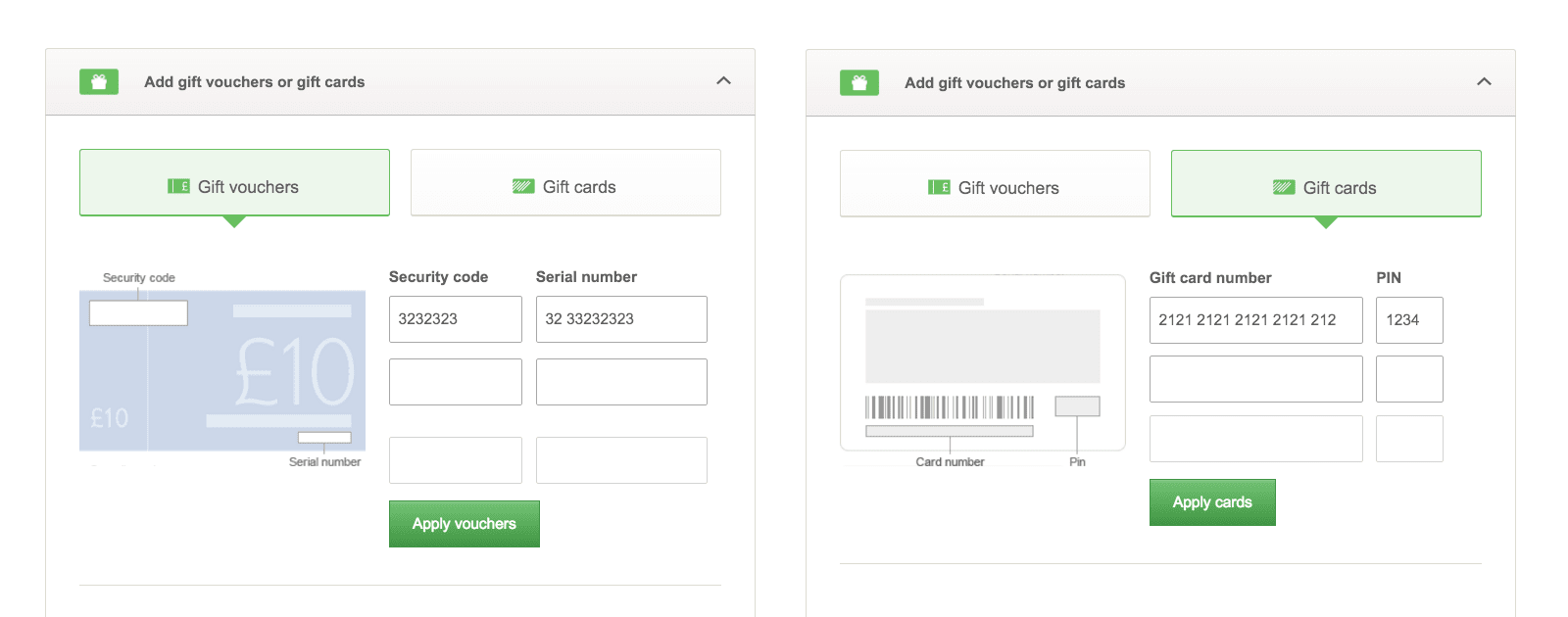
The original design, pre-2015. Desktop only.
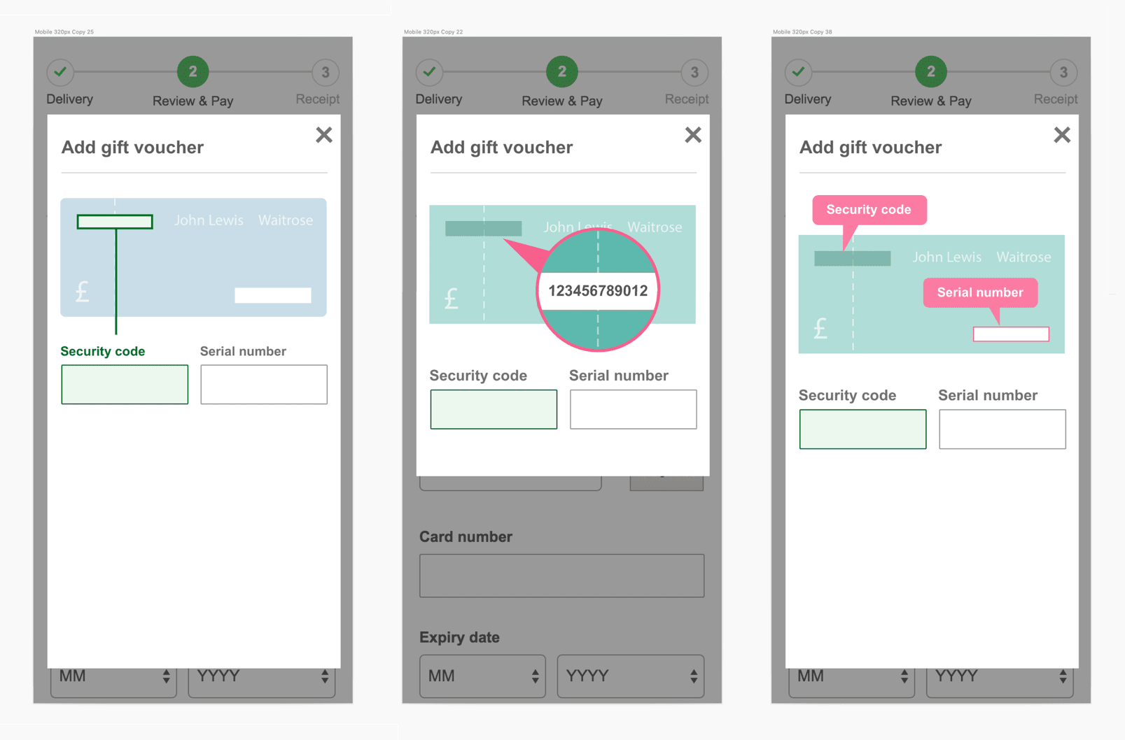
Exploring concepts for the new responsive design with a mobile-first approach.
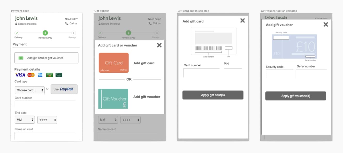
User-testing a low-fidelity prototype in the lab to get a sense of the new user flow.

A brainstorming session following the user testing sessions.
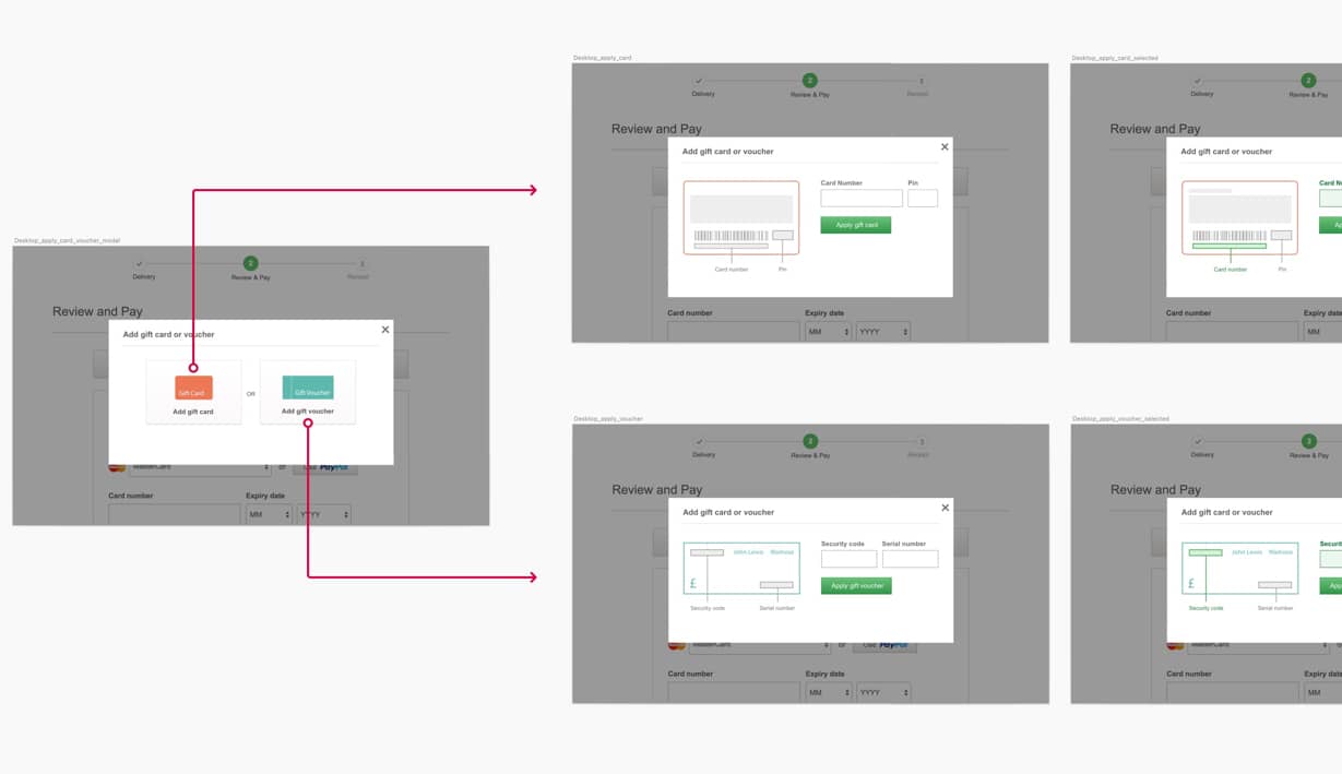
After going live with the previous version, we closely monitored real-world feedback to ensure customers were happy. We managed to reduce a few pain points in the old journey however we also identified where customers were struggling.
With version 1, the changes were mainly based around improving the UI and making the layout responsive. There wasn't any work done around improving the functionality of applying a gift card/voucher which, based on the feedback below, is an area we had to explore.
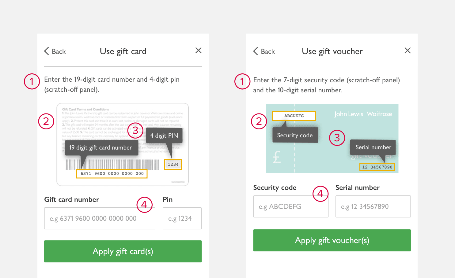
The following improvements were made to support customers with entering their information correctly:
Now that we were confident we had solved the problem with the images, the next step was to solve the functional issues. The best way to do this was via prototyping.
The thought process here was to validate each card/voucher before attempting to add another. This would solve the problems of the previous version.
We took the prototypes into the user lab for testing and they performed well, some better than others. So after a few more refinements and few more rounds of testing, we came to the final solution.
Final prototype for gift card entry including success validation, option to remove gift card and option to 'undo' removal. The functionality will be identical for gift voucher.
Each successful entry has a green flash behind the card just entered to highlight the most recent addition, making it easily identifiable in case of multiple gift cards. A message will normally be displayed underneath if there is an error.
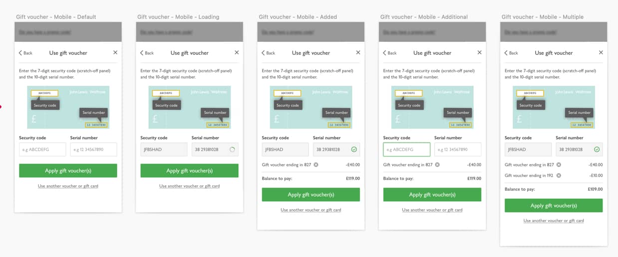
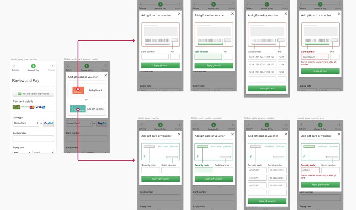
Full version 2 user flow.
Since releasing the previous version, the overall reaction was positive. Customers encountered fewer issues plus complaints about entering multiple gift cards/vouchers had massively reduced.
Whilst almost perfect, there was still a concern around customers getting confused between gift cards and vouchers and not knowing which option to select on the initial screen. This was a minor tweak, however, as the main reason for this iteration was the John Lewis rebrand. So whilst the functionality remained the same, this was primarily a visual change.
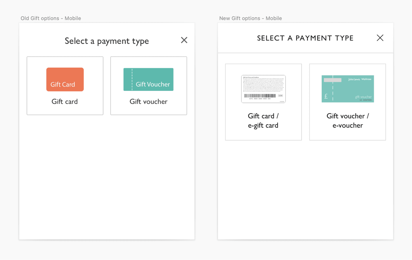
Old gift options vs new. New illustrations are not only more identifiable, they are more consistent with the images on the following step.
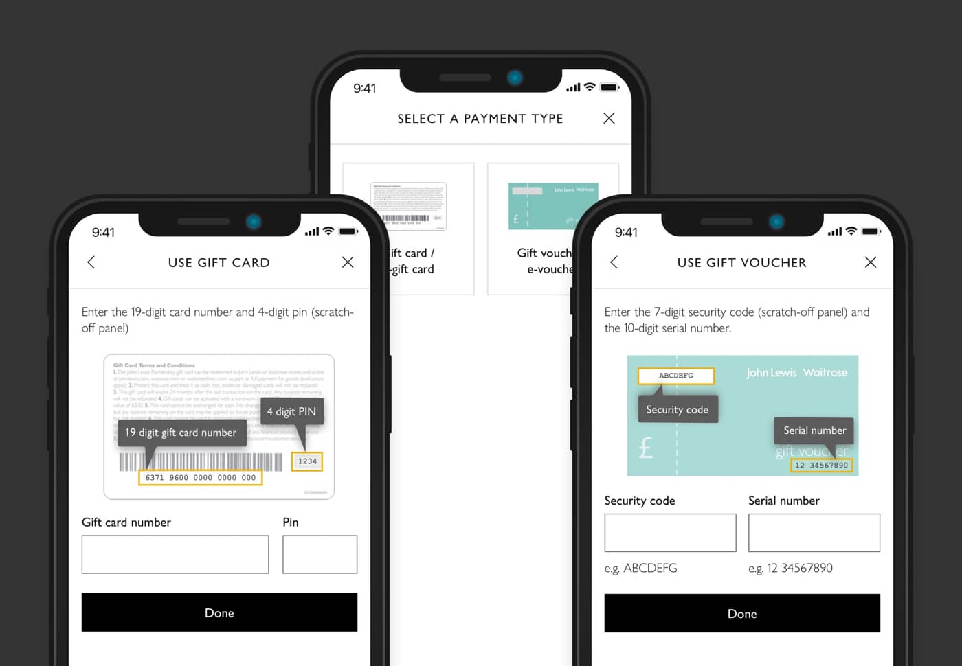
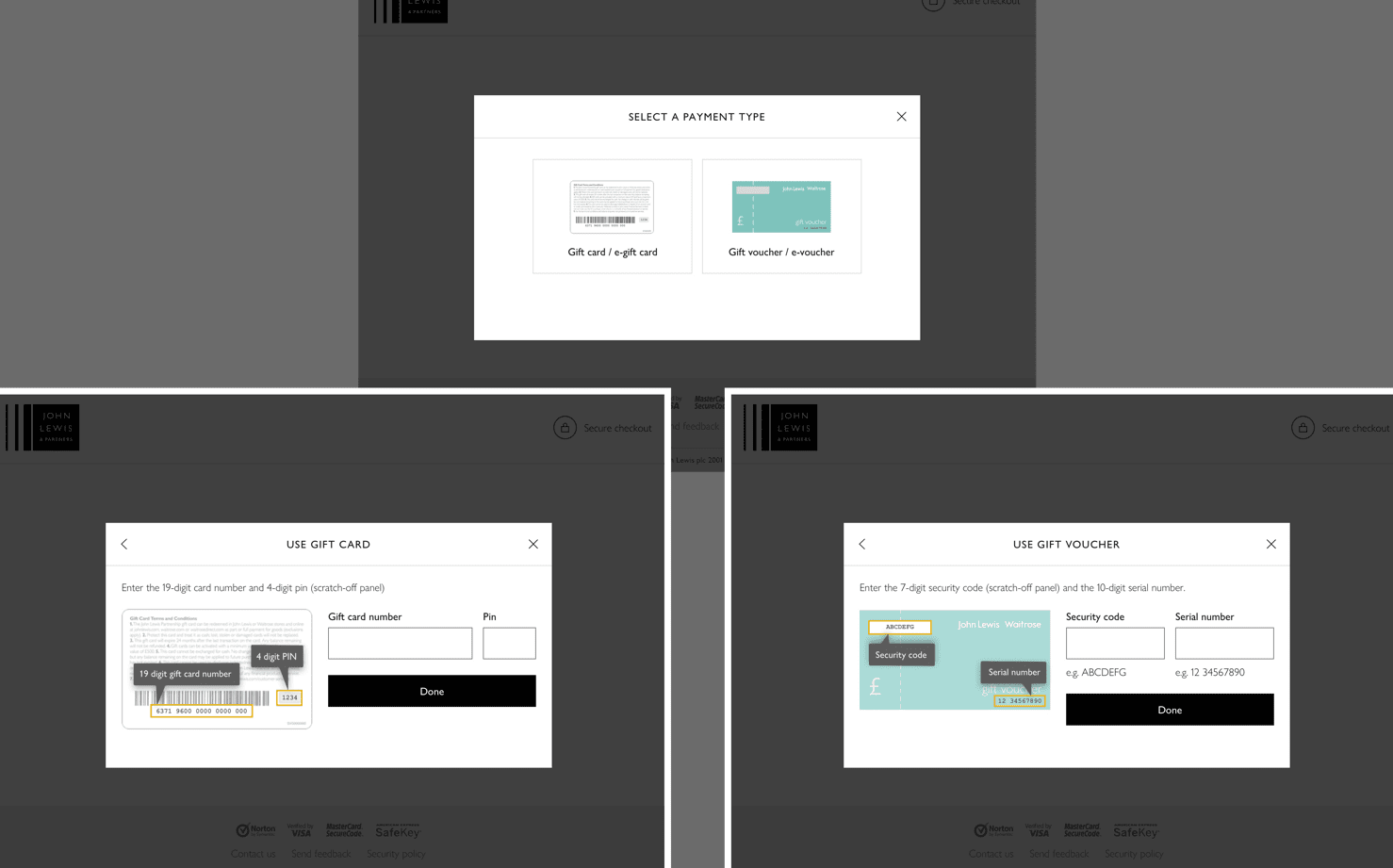
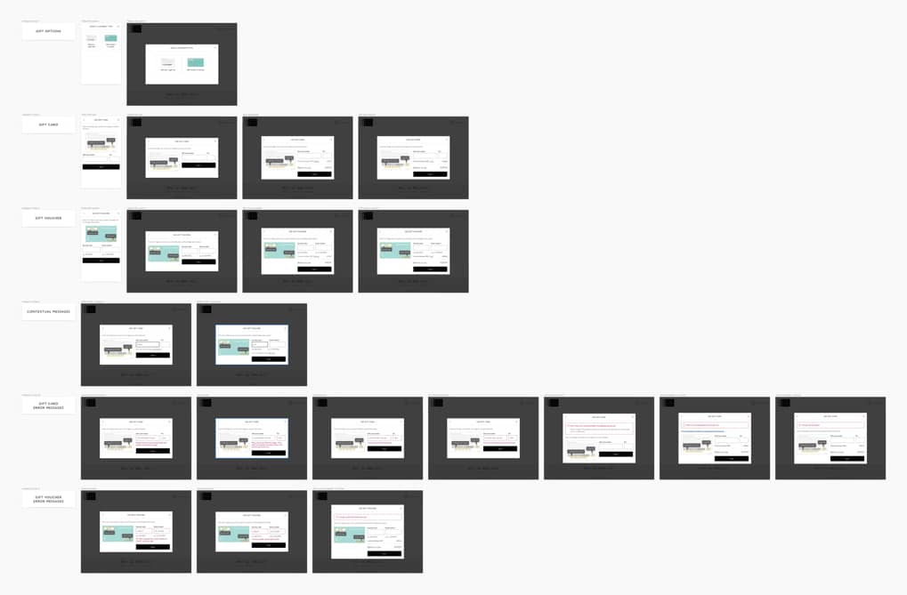
Version 3 screens including error scenarios.